Big Sir Clothing
Google UX Design Professional Certificate Project 2
Project Overview
The product:
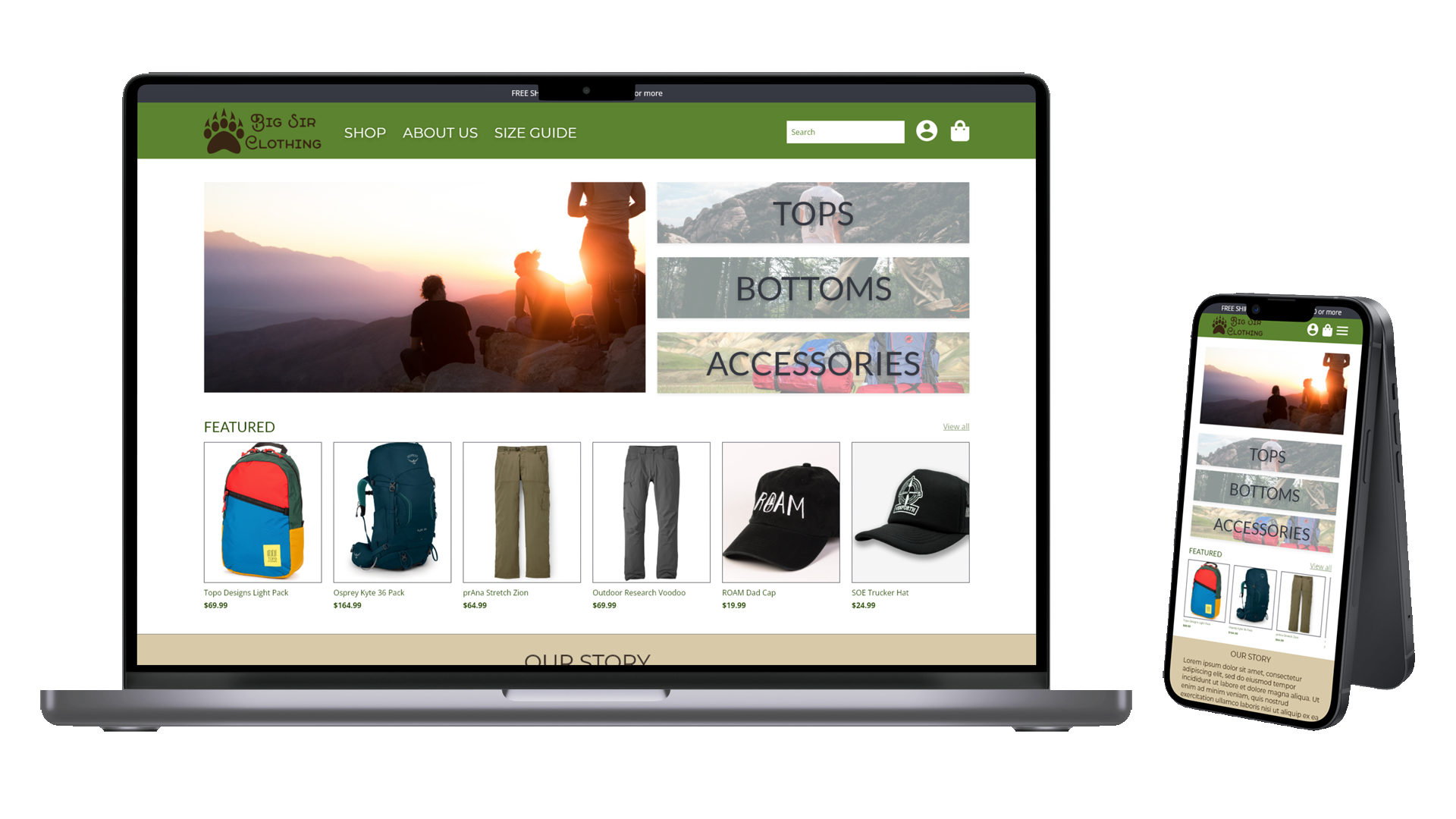
Big Sir Clothing is a clothing store that offers a variety of outdoor tops, bottoms, and accessories. The typical user is between 25-35, and most users are early career professionals. Big Sir Clothing’s goal is to make shopping easy for all types of users.
The problem:
Many online clothing stores are cluttered and hard to navigate. Users need a quick way to browse clothing, add it to cart, and checkout.
The goal:
Design a website for Big Sir that provides users a clear and efficient browsing, navigation, and checkout process.
Responsibilities:
Conducting interviews
Ideating with paper and digital wireframes
Testing low and high fidelity prototypes
Conducting usability studies
Iterating on designs
Project duration:
January 2022 - February 2022
Understanding the User
I conducted both user interviews and surveys to understand users needs and pain points. Through my research, I discovered most users had difficulty browsing clothing store websites and had problems with the checkout process. These experiences caused many users to shop less often. They wanted an easier to use shopping experience with larger pictures and clearer descriptions.
User Pain Points
Navigation
Clothing websites are often cluttered with too many options.
Clarity
Small pictures and descriptions lacking enough information.
Checkout
Users wanted secure payment methods and hate filling out their card information
User Persona
User Journey Map
I created a user journey map for Rita to gain insight on her needs and pain points when shopping a small clothing store online.
Starting the Design
Sitemap
Difficulty navigating a cluttered website and a difficult checkout process were the primary pain points for users. My goal for this sitemap was to improve navigation by clearly defining sections in the information architecture.
Paper Wireframes
I drew out paper wireframes for a few key screens that would inform the design for the rest of the website. For the home screen, I designed with the pain point of clutter in mind.
For the shop screen, I iterated designs that used large pictures for each of the clothing items.
For the item screen, I prioritized making the main picture and description section large.
To accommodate users that access the website on mobile devices, I designed a paper wireframe to adjust to the different screen size.
Revised Home Wireframe
Mobile Wireframe
Digital Wirefames
Designing digital wireframes, I continued to prioritize navigation by reducing clutter and providing easy access to shopping sections.
I designed the cart and checkout process trying to keep everything simple and easy to navigate.
This low fidelity prototype shows the primary user flow of adding clothing to the cart and checking out.
Refining the Design
Usability Study
Usability Study 1 Findings
Users were confused by the homepage, wanting more items visible above the fold.
The item page displayed too much information above the action buttons.
Users were overwhelmed and confused about the different checkout steps.
To address the user pain points found in the usability study, I reduced the size of the gallery and moved the clothing sections to the top to allow users to easily navigate above the fold.
Before Usability Study
After Usability Study
Insights from the usability study showed that users wanted drop down menus for sizes and quantity and less information above the action buttons.
Before Usability Study
After Usability Study
Users were confused by the original checkout screens. Along with adding payment to the first screen, I arranged the information of each checkout screen to more accurately reflect the part of the checkout process.
Before Usability Study
After Usability Study
To accommodate users on mobile, I designed a more mobile friendly experience for the different screen size.
I used the same user flow as the low fidelity prototype, including any changes made after conducting the usability study.
Going Forward
Through this project, I learned that small changes to a design can drastically change a user’s interaction with the product. Designing for a user’s experience above the fold as well as designing for mobile web experiences presented interesting challenges. It made me think about how I could cultivate digital space much like I would physical space, like rearranging furniture to make the flow of the room more user friendly.
Next Steps:
Conduct more usability studies to understand if the website is meeting all user needs and addressing their pain points.
Research website accessibility and add any changes to the website design.
