WeCare
Google UX Design Professional Certificate Project 3
Project Overview
The product:
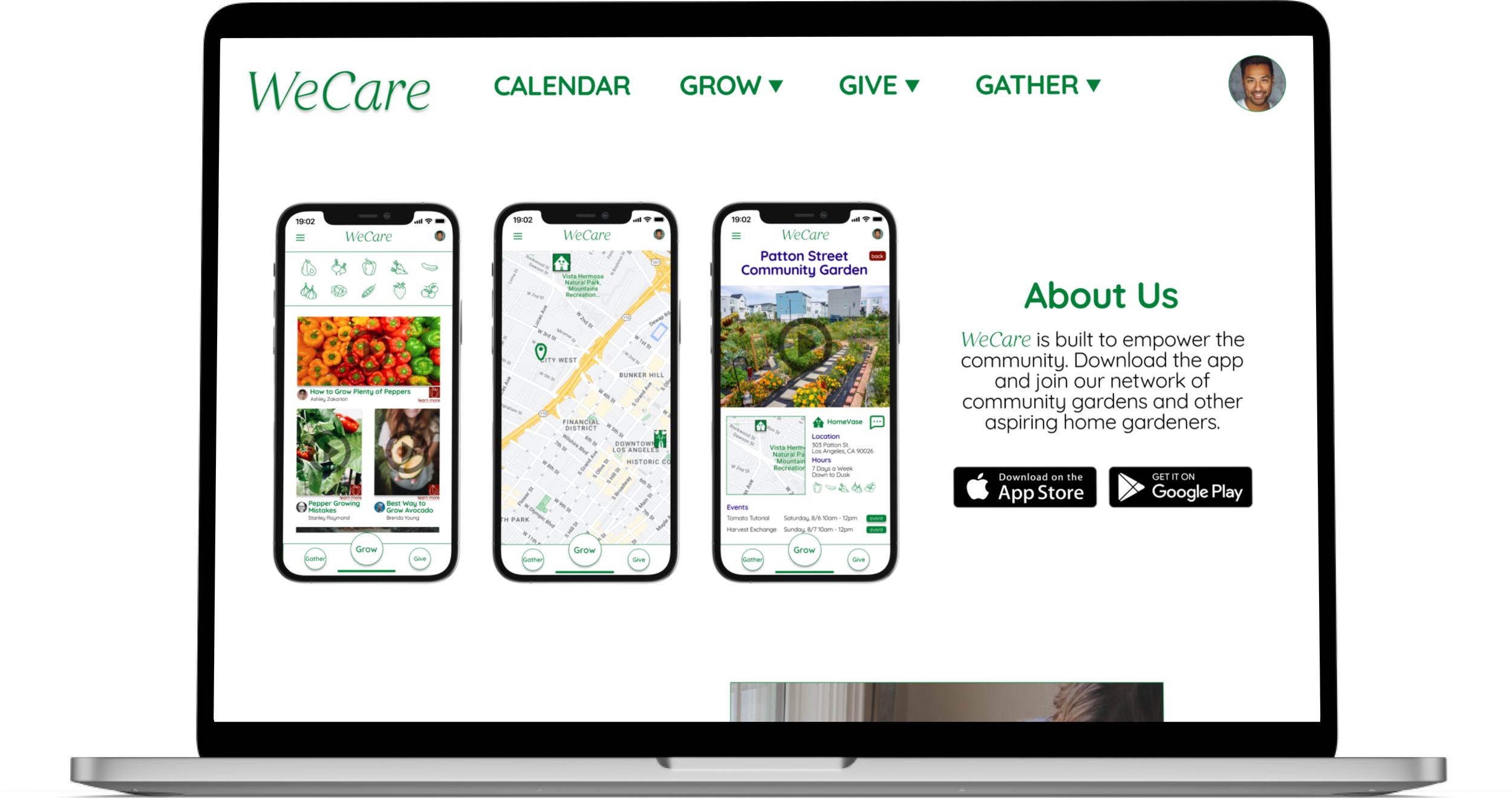
WeCare is an organization focused on empowering communities to grow their own food. The app and website are a tool to educate, provide resources, and foster communication within the community. WeCare’s primary users include working adults who want to give back to the community while also learning to grow food.
The problem:
Community gardens have existed for many years, but many people are cautious of the safety of the food grown there. They would like to grow their own food and give back to their communities but lack the resources.
The goal:
Design an app that educates people on how to grow their own food while creating a platform for them to help their communities.
Responsibilities:
Conducting interviews
Ideating with paper and digital wireframes
Testing low and high fidelity prototypes
Conducting usability studies
Iterating on designs
Project duration:
May 2022 - October 2022
Understanding the User
I conducted both user interviews and surveys to understand user needs and pain points. Through my research, I discovered that users were concerned with two major points about community gardens: safety and resource management. They expressed interest in using a community garden if they felt the food was safe as well as managed properly.
User Persona
User Journey Map
I created a user journey map for Charlie to gain insight on his needs and pain points when looking for ways to give back to the community.
Starting the Design
Paper Wireframes
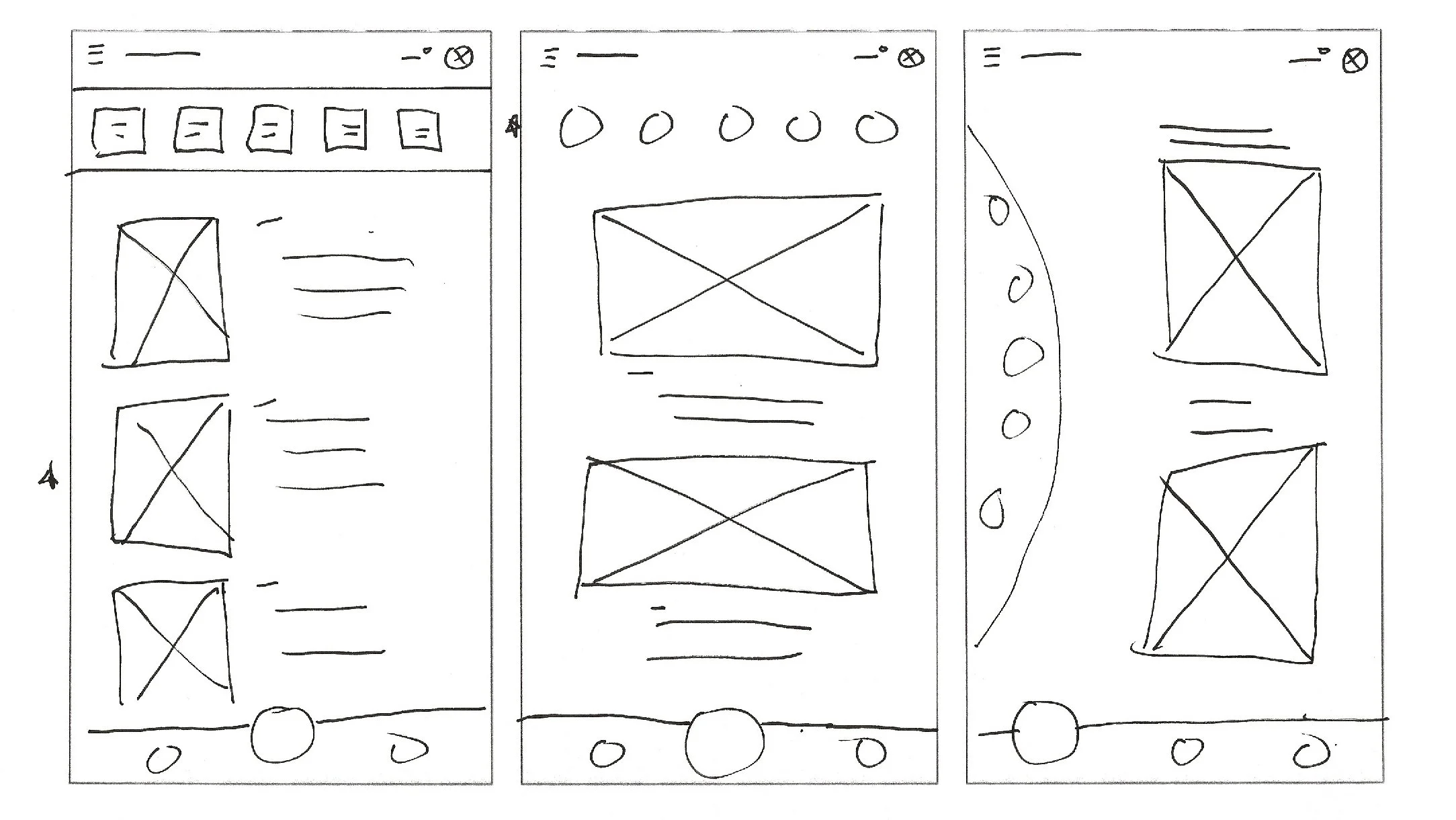
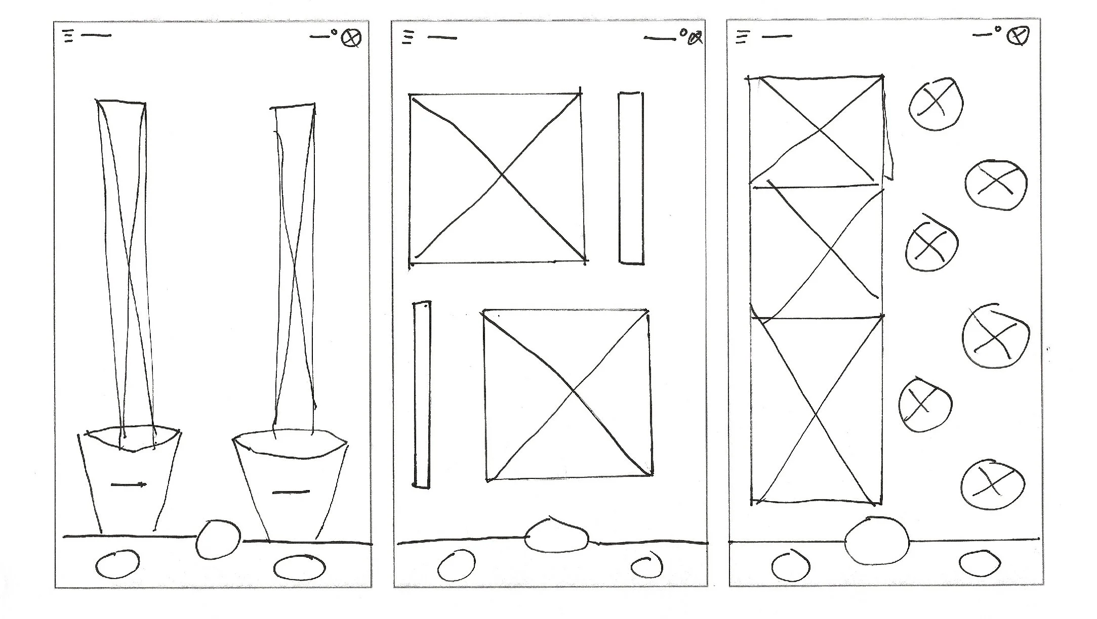
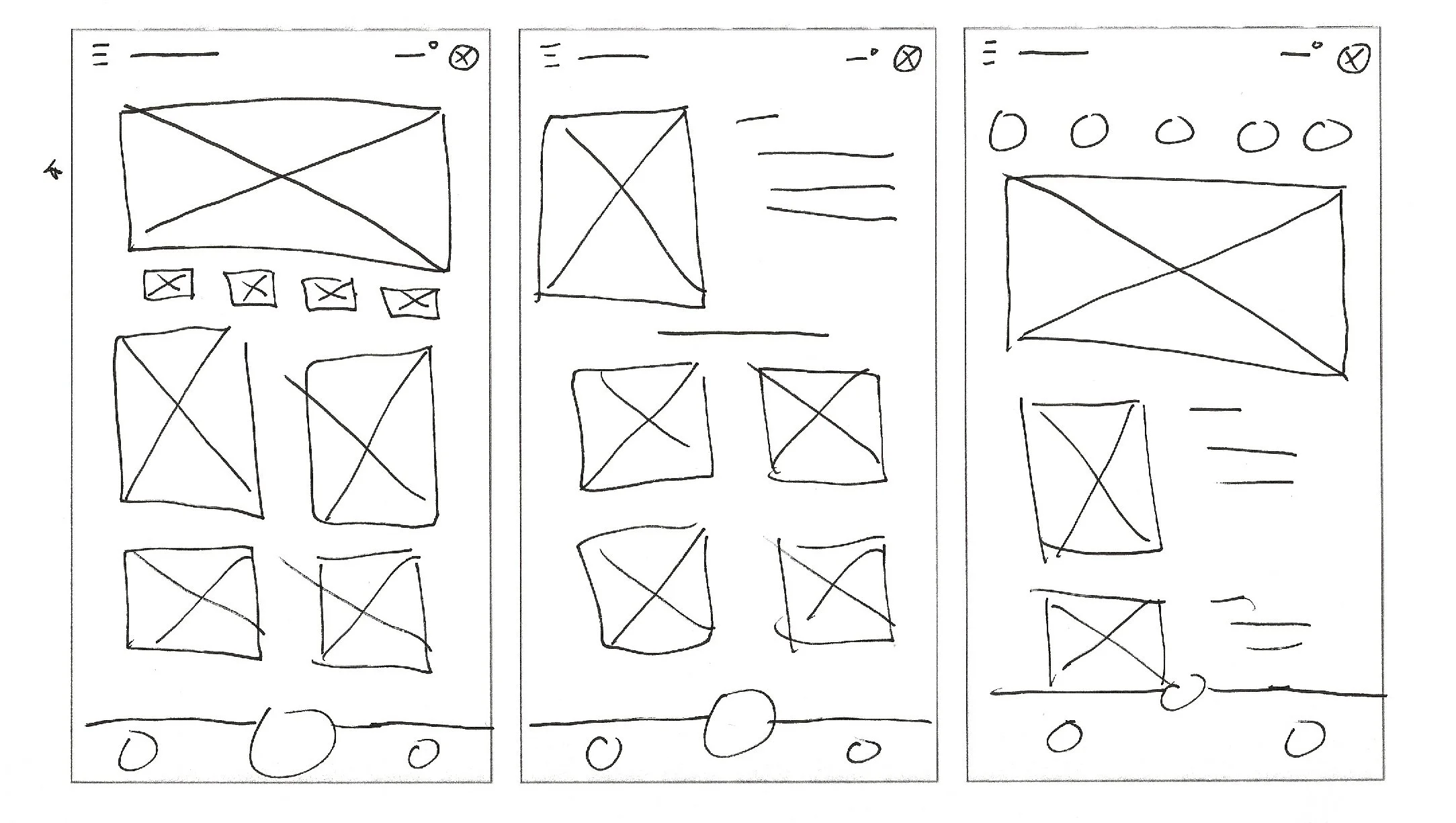
I drew quick paper wireframes for each of the major screens. The first screen I ideated was the Gather sceen where users would be able to locate their nearest community garden.
Then, I ideated the Give screen where users would give back to their community through donations or volunteering.
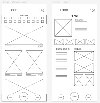
Lastly, I designed the Grow screen where users learn how to grow their own food.
Digital Wirefames
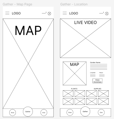
After ideating with paper wireframes, I designed the initial screens with the focus on easy navigation among the three major features of the app.
I created this low-fidelity prototype to use in a moderated usability study. The user flow connects the three main app features, focusing on navigation and ease of use.
Refining the Design
Usability Study
Usability Study 1 Findings
Users had trouble moving back through the user flow.
Users noted that some of the screens contained too much unneeded text.
Users had difficulty understanding what they were able to click on.
Based on the insights from the usability study, I changed various aspects of the design to reduce clutter and improve navigation. This was done by adding a back button as well as other buttons to navigate to other sections easier.
Before Usability Study
After Usability Study
Additionally, I used icons and color to distinguish different clickable elements. This was carried over throughout the different screens of the app.
Before Usability Study
After Usability Study
The high-fidelity prototype followed the same user flow as the low-fidelity prototype with an changes made from insights gained from the usability study.
Mockups
Responsive Design
Site Map
After designing the app, I began designing a corresponding responsive website. This site map keeps the same three major features from the app to maintain consistency between both experiences.
Website Design
Mobile
Tablet
Desktop
Mockups
Going Forward
Through designing this app and website, I learned that user concerns can be addressed through design decisions. Design can affect how someone thinks and operates within their community.
Next Steps:
Connect with local community gardens to research real world application of the designs.
Add more resources for the different plants that can be grown at home.
Develop safety and privacy measures to ensure user and food security.

