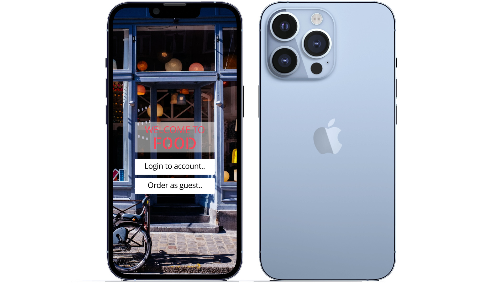
FOOD menu app
Google UX Design Professional Certificate Project 1
Project Overview
The product:
FOOD is a modern restaurant located in the suburbs of Los Angeles. They offer a simple selection of dishes with rotating specials. FOOD targets customers that want to try new food but need to order it quickly.
The problem:
Customers find restaurant menus cumbersome and hard to decipher.
The goal:
Design an app for FOOD that allows users to efficiently discover and find food and quickly order it.
Responsibilities:
Conducting interviews
Ideating with paper and digital wireframes
Testing low and high fidelity prototypes
Conducting usability studies
Iterating on designs
Project duration:
December 2021 - February 2022
Understanding the User
I conducted both user interviews and surveys to understand the users I’m designing for, their needs, and their pain points. There were two distinct user groups found through research, people with busy schedules that want quick, efficient menus and older people who have trouble deciphering menus.
Research into both user groups revealed the need for intuitive, easy menu navigation. Both groups encountered problems navigating menus and finding specific menu items. Other problems included problems downloading the menu and inability to order directly from the menu.
User Pain Points
Legibility
Menus are either scanned copies that come out blurry or have a font size that is too small to read.
Efficiency
Text heavy menus bog users down in unnecessary clutter and make it hard to find specific items.
Clarity
The lack of pictures of descriptions of food make it hard for users to decide what to eat.
Time
Busy people want quick ways to order and receive their food.
User Persona
User Journey Map
Mapping Brandon’s user journey revealed that a dedicated food menu app with the ability to order food would solve many pain points.
Starting the Design
Paper Wireframes
I decided to iterate for each major part of the user flow. For the home screen, I iterated on ways to display all the different menu sections on one screen. I also designed different ideas for the top and bottom bars that would stay throughout the rest of the design.
For the menu screen, I iterated designs with big pictures for each menu item. Through iterating, I was able to design a floating button system to allow easy transition between different menu sections.
For the checkout screen, I iterated designs focused on having all the information on one screen without scrolling.
Digital Wirefames
As I transitioned into digital wireframes, I continued to focus on addressing user needs and feedback. In this early iteration, I designed ways to make it easy for users to navigate through the menus.
The low-fidelity prototype shows the primary user flow of finding and ordering food. It was built to allow testing in a usability study with users.
Refining the Design
Usability Studies
Usability Study 1 Findings
Users wanted a search function
Users had difficulty reading the menu
Users needed specific confirmations
Early designs had all the food items on one screen. After Usability Study 1, I changed to a scrolling menu that made the pictures and description easier to decipher.
Before Usability Study 1
After Usability Study 1
Usability Study 2 Findings
Users didn’t understand special icon
Quantity buttons were too small
Add to order buttons were too small
In the initial high fidelity prototype, Specials had a corresponding icon in the bottom bar. After Usability Study 2, I made it part of the main food menu screens because users did not understand the icon. I also made the quantity and add to order buttons bigger to match the large pictures and make it easier for users to press.
Before Usability Study 2
After Usability Study 2
The latest high-fidelity prototype allows for easier navigation between the menus and also addresses the user pain points found during the usability studies.
Going Forward
As this was my first UX Design project, I gained a breadth of knowledge about user research and its importance in the design process. Understanding and empathizing with users and conducting usability studies allowed my design to evolve through it’s many iterations. This project taught me that my own preconceived ideas about how an app should be aren’t always correct.
Next Steps:
Conduct more usability studies and develop new ideas based on the new findings.
Conduct more accessibility research and studies.
